
Bitesize UX Contest 1st Place🏆 Submission
Redesign of Kickstarter’s project overview step in the onboarding flow that focuses on solutions for the supplied user pain points.
KICKSTARTER REDESIGN
ROLE
UX Designer, UI Designer
TOOLS
Figma, FigJam, Proto.io, Notion
DURATION
1 week
DESIGN CONTEST OVERVIEW
CHALLENGE
You’re a designer at Kickstarter, a crowdfunding platform where people can launch and get funding for creative projects, technology, and inventions.
Redesign this experience to help creators feel more confident about starting to build and launch their project on Kickstarter.
USER SCENARIO
When a user is creating a project to launch on Kickstarter, they are asked a series of questions to create their project.
The first set of questions asks about the basic details of the project. Answers from these questions will be used to populate the project card, which potential funders will see when browsing through projects.
CONSTRAINTS
Design for a mobile app.
Focused on onboarding flow.
New users must sign up, verify AND donate before user can access mentors/chats/etc.
PROBLEM
Kickstarter is seeing a huge drop-off on completion rate at this screen.
People want to create a project, and then abandon it once they are asked these questions.
WHY?
Creators don’t know what their project is going to look like when users see it on the front end.
Creators know that a first impression is important, but need some guidance on good titles, descriptions, and images.
Creators aren’t sure if they’ll be able to edit this later, or before they launch it (they can)...this causes them to abandon until they have the perfect copy and images.

Original Project Overview screen
AREAS TO FOCUS ON

After establishing How Might We statements for the user pain points, I worked on brainstorming as many ideas as I could for potential design solutions.
Some time was then spent on searching for inspiration and taking screenshots of existing product elements with notes for a lightning demo to showcase clearer potential ideas for design solutions in those 3 areas of focus.
DEVELOPING SOLUTIONS

SOLUTIONS SKETCHES
Having now ideated plenty of potential design solutions, I took the ones that I felt answered the How Might We statements best and began rough sketching them out.
I continued iterating and evolving those into a more solidified idea before digitizing them into wireframes.
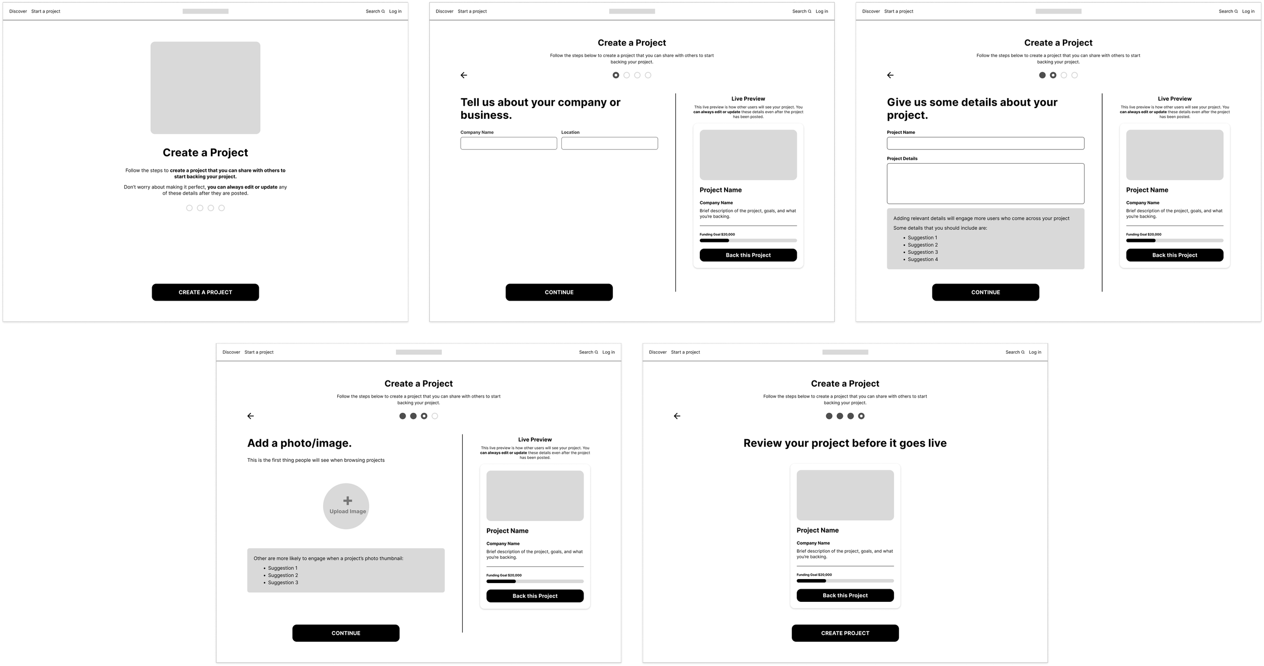
WIREFRAMES
DELIVERING THE SOLUTION

Design Solution Area #1

Design Solution Area #2

Design Solution Area #3

NEXT STEPS
The following steps would be worked on next to continue refining & improving the design solutions:
Conduct an initial round of usability testing to identify which elements of the redesign are resonating the most and which elements are still showing some friction with users.
Refine design solutions based on those findings.
Establish voice principles and tone to refine copy throughout.