Bus There
BusThere was created for new and casual bus riders making it easy for them to decode the new complex bus transit system of Chicago when trying to figure out how to bus from here to there.
Overview
Problem
With an expansion in the Chicago transit system, new bus routes have been added, resulting in existing stops having to now serve multiple bus routes.
Some stops now have up to 7 lines passing through them everyday causing issues with riders being able to figure out the desired bus information for their trips.
Solution
Create an optimal experience that ensures all users are able to achieve business requirements by:
Presenting complex information in a simplified & intuitive structure to minimize cognitive overload.
Creating an optimal user flow that can solve multiple user problems.
Minimizing distractions and only including necessary information.
Allowing users to use application’s full functionality without any commitments.
Project Scope
Target Audience
The casual/infrequent bus rider.
Roles
UX Researcher, UX Designer, UI Designer, Product Designer
Duration
5 Weeks
Tools
Figma, FigJam, Adobe Creative Suite, Google Workspace, Zoom, Notion, Asana
Discovery & Analysis
Competitive Analysis
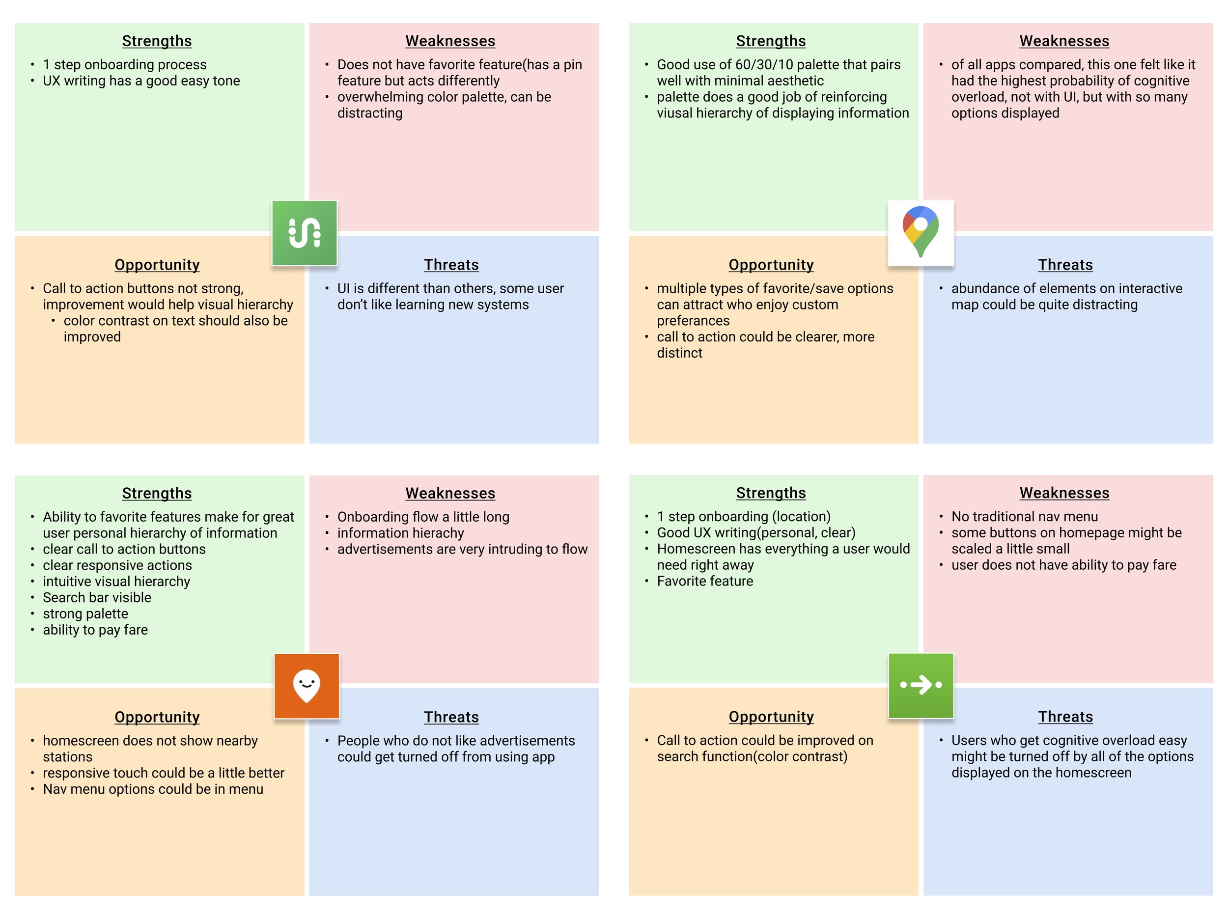
The first method I employed was a SWOT analysis on 4 competitor apps to see what was currently out in the market.
The goal was to start by looking at some of these apps to see what worked and what did not work to keep those aspects in mind when doing research on elements that could possibly be implemented or avoided when in my content further in the process.
User Surveys & Interviews
A user survey was created & deployed through various social channels such as Instagram, Twitter, Reddit, & group text threads. It generated key insights such as user demographics, pain points, priorities, & possible solutions.
Interviews were conducted to allow users to think & speak through answers while following up with relevant questions in a long forum medium to gather more qualitative insights to understand the user on a deeper level.
Key Takeaways
Research confirmed client’s implied user pain points.
As age went up, use of transit apps went down.
Target audience is a casual rider or infrequent bus rider.
All interview participants brought up the fact that they liked having a favorite feature to simply their processes making apps easier for them.
User Persona
Having now gathered a solid chunk of the research, it was time to deeply analyze my data & put together a more solidified user persona that would more accurately represent the target user the product based on actual research.
A sign I was on the right path was that the gathered data constructed a User Persona that was shockingly close to one of the proto-personas, with a couple of minor differences.
User Flow
Having set the user stories I could now begin to think about what the actual flow of steps would be in order for the users would take to accomplish those tasks. After some iterations of sketches and digital comps, I decided to optimize the flow in a singular flow that could accomplish all of the tasks.
User Stories
While looking over my data to form the high priority user stories, I considered one of the key takeaways from the research in which all interview participants mentioned how they really enjoyed having a favorite feature on their favorite apps and how it made their processes much easier.
Wanting to add ease and simplicity to the interactions with the app, I decided to include a 4th high priority based on the research findings to along with the client’s requirements.
As a bus rider, I want to know when my bus is arriving, so I can calculate how much time I have to reach the bus stop.
As a bus rider, I want to know what bus arrives next bus, so that I don’t have to rush to the stop if it is not my bus.
As a bus rider, I want the ability to view future arrival times for any of the seven bus lines (serving Washington & State), so that I know when my bus arrives.
As a bus rider, I want the ability to favorite stops and bus lines, so I could make the planning for my day easier.
Product Development
Sketches & Wireframes
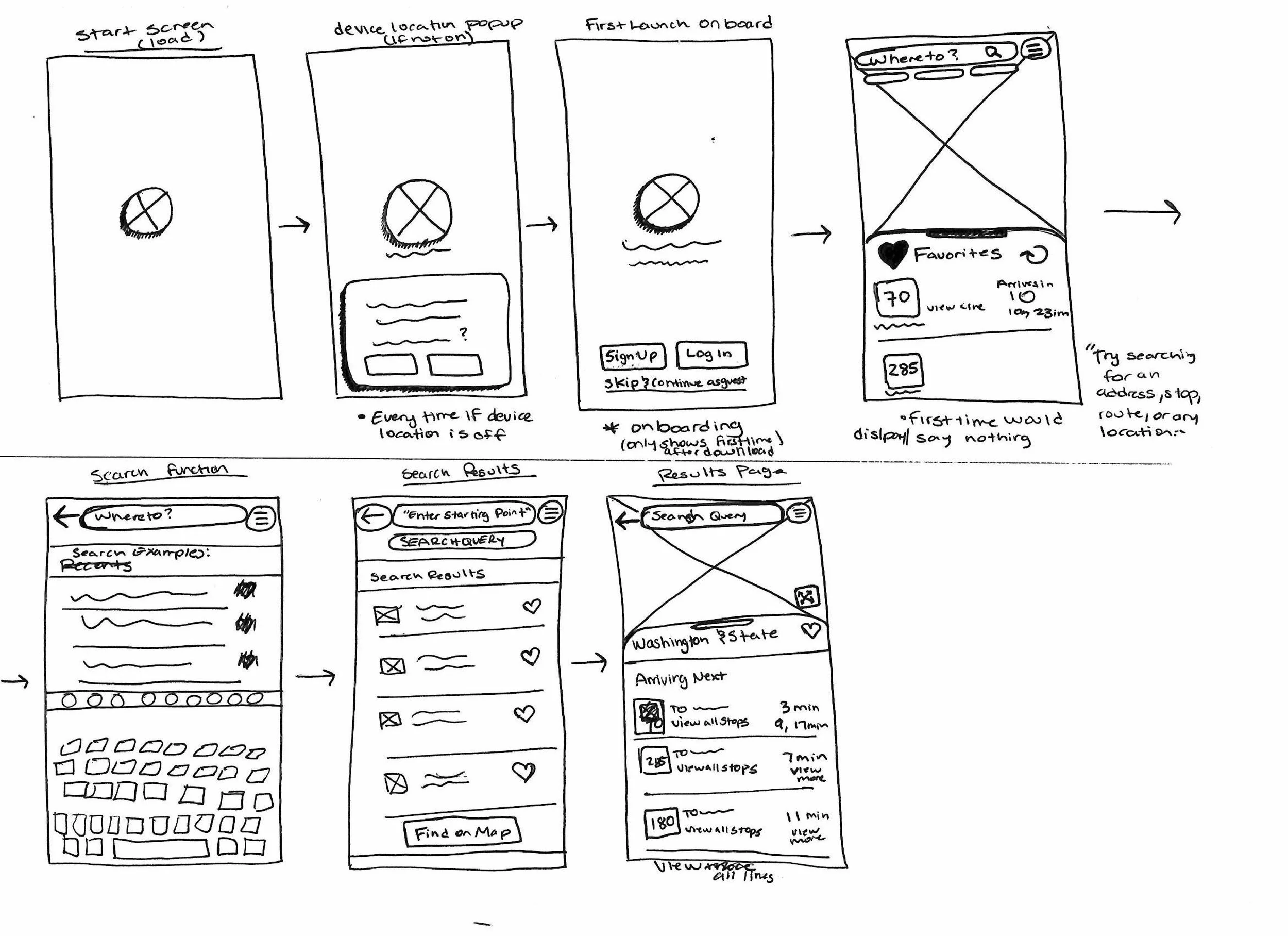
Having the content structure set, I could begin to ideate how the app would be laid out and was now able to begin building out the skeletal foundation of the wireframes.
I started by sketching out each page that would be necessary for a user flow to achieve each of the 4 high priority user stories. I then went on to digitize them while paying more attention to the spacing between potential UI elements as well what placement of items worked best.
Wireframes
The wireframes were then turned into a low-fidelity clickable prototype that could now be tested to see if the content strategy laid out so far was working or not with the intended experience for the user.
An informal usability test was done with very basic tasks to gauge whether or not the development of the product until was headed in to the right direction.
Key Takeaways
Placement of UI elements were intuitive, no major signs of user confusion
Scenarios and tasks could have clearer instructions in what needed to be achieved.
Placeholder text was a detriment to user scanning for information.
Some text was too small.
Branding & Identity
Self SWOT Analysis
The develop phase of the process is where I began to really hone in on the visual design & layout of the application. I looked at different existing mental models and best practices in hopes of building a more user centered design experience that is intuitive and familiar for all types of users.
My research participants stated that they do not use bus apps because they are complicated to use. I kept this in mind while think about the branding and identity of the app where the intended feel of the app was to be simple and easy to use for all users.
“Bus There”
I chose “Bus There” because I wanted a name to line up with identity in being a practical, easy to use and to the point app.
The simplicity and efficiency of “BusThere” gives a clear implication as to what the app’s purpose is immediately so that potential users will know what this app is for just by looking at the icon.
Having decided the name for the product I then did a competitive analysis on myself with SWOT analysis and mind mapping exercise to see what the app would stand for based on the everything I’d accumulated to this point.
Moodboard
Before gathering visual inspirations for the app's mood board I began by doing a deep dive on the city of Chicago trying to see if there was some kind of identity I could put together from different aspects of Chicago to see if it was possible to tailor the app’s visual design with something that already lines up with Chicago.
Once familiarizing myself with different aspects of the city, I began developing a visual mood board with imagery that fit the vibe of the research with some clearer inspiration ideas.
The design style of Mies Van der Rohe (a german architect who designed the first modern American buildings in Chicago) was a really big influence that I wanted to keep in mind when making decisions on the branding and identity.
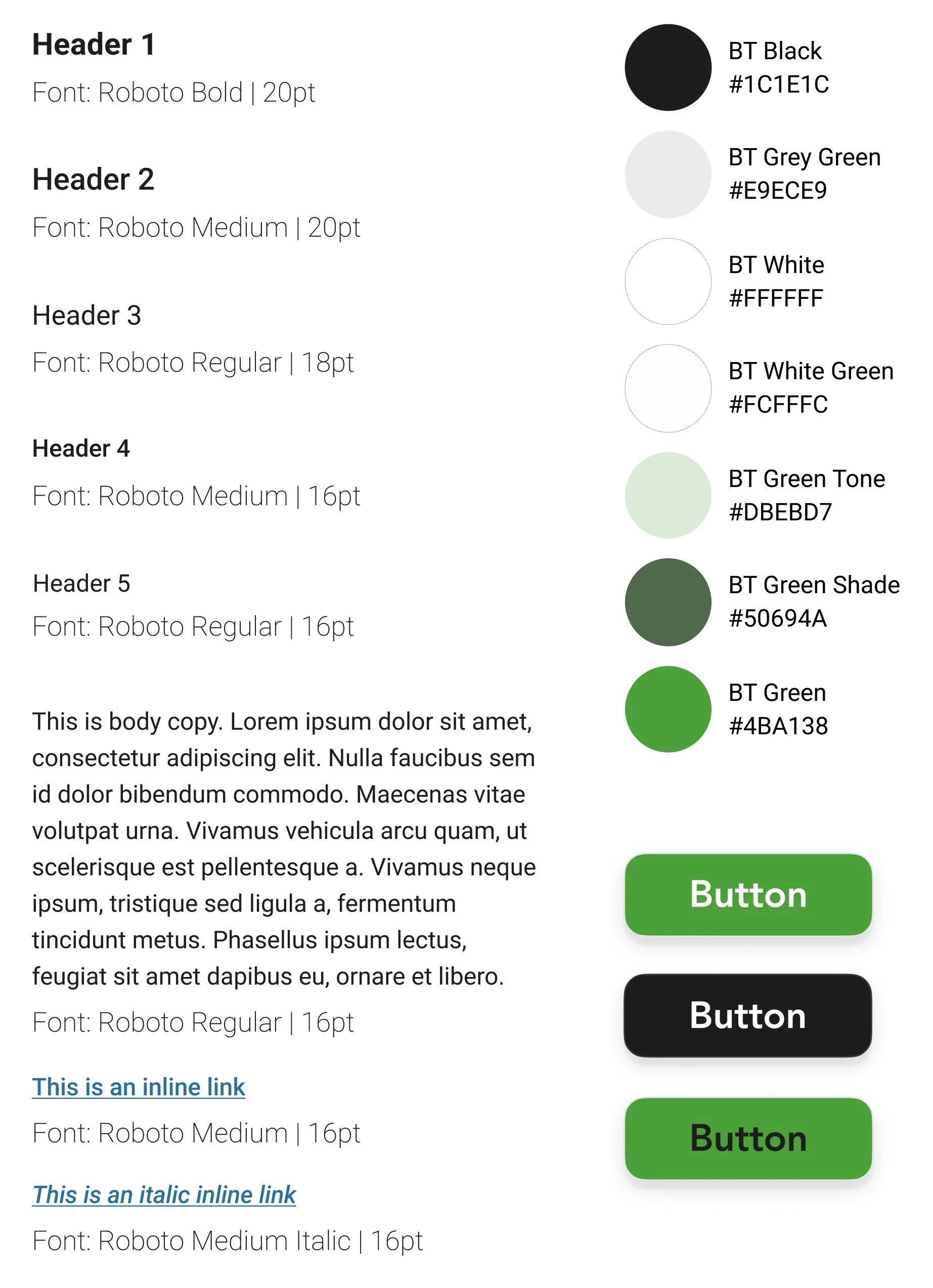
Style Guide
Identity Development: Sketches
While creating the initial sketches for the logo, I really wanted to imply a sense of direction and movement to compliment the fact that it is a transportation service.
I did that by doing some custom text work on the type by making some aspects more vertical and also implementing the arrows coming out of the ‘b’ and ‘t’ going in vertical and horizontal directions.
Identity Development: Digital Iterations
I continued with different iterations before settling and applying color. I went with a simple touch of color in green. I chose this color because I thought worked with the mental model of ‘green means go’ to compliment the sense of direction that the arrows in the custom text were giving implying movement and non stagnancy.
The palette of green tones, black and white matched up with the app’s identity in being simple and not overwhelming. The black and white add a sense of stability and mimic a road sign that user would see on the side of the road.
Finalized Product Identity
High Fidelity Prototype
Having now set the foundations of the style guide for the product I implemented those into the refined prototype to create the first iteration of the high-fidelity prototype.
I then ran some initial usability tests to see how the prototype stood and what needed to be improved.
Taking those key finding from the usability tests, I implemented those changes to update the high-fidelity prototype to the 2nd iteration and most up to date version.
Usability Test Insights
Users initially glancing over critical information on the bus stop page
Some users were unsure on how to read times
Lack of ‘starting point’ kind of threw off some user’s flow
Next Steps
Continue refining product with more iterations of usability tests to see what can be improved and implemented for users to achieve high priority problems.
Move on to mid-lower priority user problems after launch to continuously improve the product.
Analyze pain points that I came across in the double diamond process for this case study and work on improving those process to gain better insights moving forward.
Conclusions
At this point of the case study I now have produced a minimum viable product that achieves the highest priority problems while keeping a focus on creating a user centered design for my target audience.
For being my first case study I feel that I understood the process well enough to see clearly what areas I could have prepared for and constructed better to help my process.


